The Old Alchemist Gin
The Old Alchemist Gin
The Old Alchemist is a premium dry gin brand I created as a student packaging project: a fictional English gin with an invented heritage, built to feel collectible on the shelf.
The packaging won Gold at the 62nd GDUSA Package Awards and at Graphis New Talent 2025, an American Advertising Federation ADDY Crystal Award, and Best in Show at the TCU Kick-Ass Show.
Client
Client
Student Work
Student Work
Year
Year
2025
2025
Project type
Project type
Packaging, Branding, Illustration, Photography, Copywriting
Packaging, Branding, Illustration, Photography, Copywriting
Credits
Credits
Design by Andy Nguyen
Photography by Andy Nguyen
Design by Andy Nguyen
Photography by Andy Nguyen
My role
My role
Brand concept, illustration, packaging design and photography.
Brand concept, illustration, packaging design and photography.

Awards and recognition
Awards and recognition
62nd GDUSA Package Award 2025 Gold Award
Graphis New Talent 2025 Gold Award
American Advertising Federation ADDY Crystal Award
TCU Kick-Ass Show Best In Show
62nd GDUSA Package Award 2025 Gold Award
Graphis New Talent 2025 Gold Award
American Advertising Federation ADDY Crystal Award
TCU Kick-Ass Show Best In Show
The Challenge
The Challenge
Make a new gin feel like it has a past.
Make a new gin feel like it has a past.
Craft gin shelves are crowded with heritage stories. The Old Alchemist needed to earn its sense of age and craft through the packaging itself, not just a date on the label, and to feel more layered and collectible than a standard front-and-back label system.
Craft gin shelves are crowded with heritage stories. The Old Alchemist needed to earn its sense of age and craft through the packaging itself, not just a date on the label, and to feel more layered and collectible than a standard front-and-back label system.
The Solution
The Solution
Three labels, one story.
Three labels, one story.
I split the packaging into three pieces that each carry part of the story: a wraparound label with a juniper farm illustration for origin, a silver ticket-style label that nods to England’s old travel tickets and printed ephemera, and a neck band marking the brand’s fictional founding year, 1943.
I split the packaging into three pieces that each carry part of the story: a wraparound label with a juniper farm illustration for origin, a silver ticket-style label that nods to England’s old travel tickets and printed ephemera, and a neck band marking the brand’s fictional founding year, 1943.
The anatomy of the bottle
The anatomy of the bottle
Three pieces that work as one
Three pieces that work as one
Most gin bottles rely on one main label or a simple front-and-back system. I divided The Old Alchemist into three separate pieces to create more depth, storytelling and shelf presence.
The wraparound label is built around my illustration of a juniper berry farm, tying the bottle to gin’s key ingredient and giving the brand a sense of place. The silver ticket-style label takes its cue from England, where gin first found its identity, using a reflective material and a structured layout that reference old travel tickets. The neck band finishes it with “Since 1943,” a quiet reminder of the brand’s fictional heritage.
Each piece has its own job, but together they make the bottle feel more layered and collectible than a traditional two-label system.


The three pieces on the bottle: the neck band, the wraparound label and the silver ticket. Beside it, my illustration for the wraparound label.
The three pieces on the bottle: the neck band, the wraparound label and the silver ticket. Beside it, my illustration for the wraparound label.

The wraparound label and the silver ticket, laid flat.
The wraparound label and the silver ticket, laid flat.


Up close: the story panel on the back of the label, and the “Since 1943” neck band.
Up close: the story panel on the back of the label, and the “Since 1943” neck band.
Photography
Photography
Shot like a heritage spirit
Shot like a heritage spirit
I photographed the bottle myself, styling every shot to carry the same old-world, crafted character as the labels.
I photographed the bottle myself, styling every shot to carry the same old-world, crafted character as the labels.


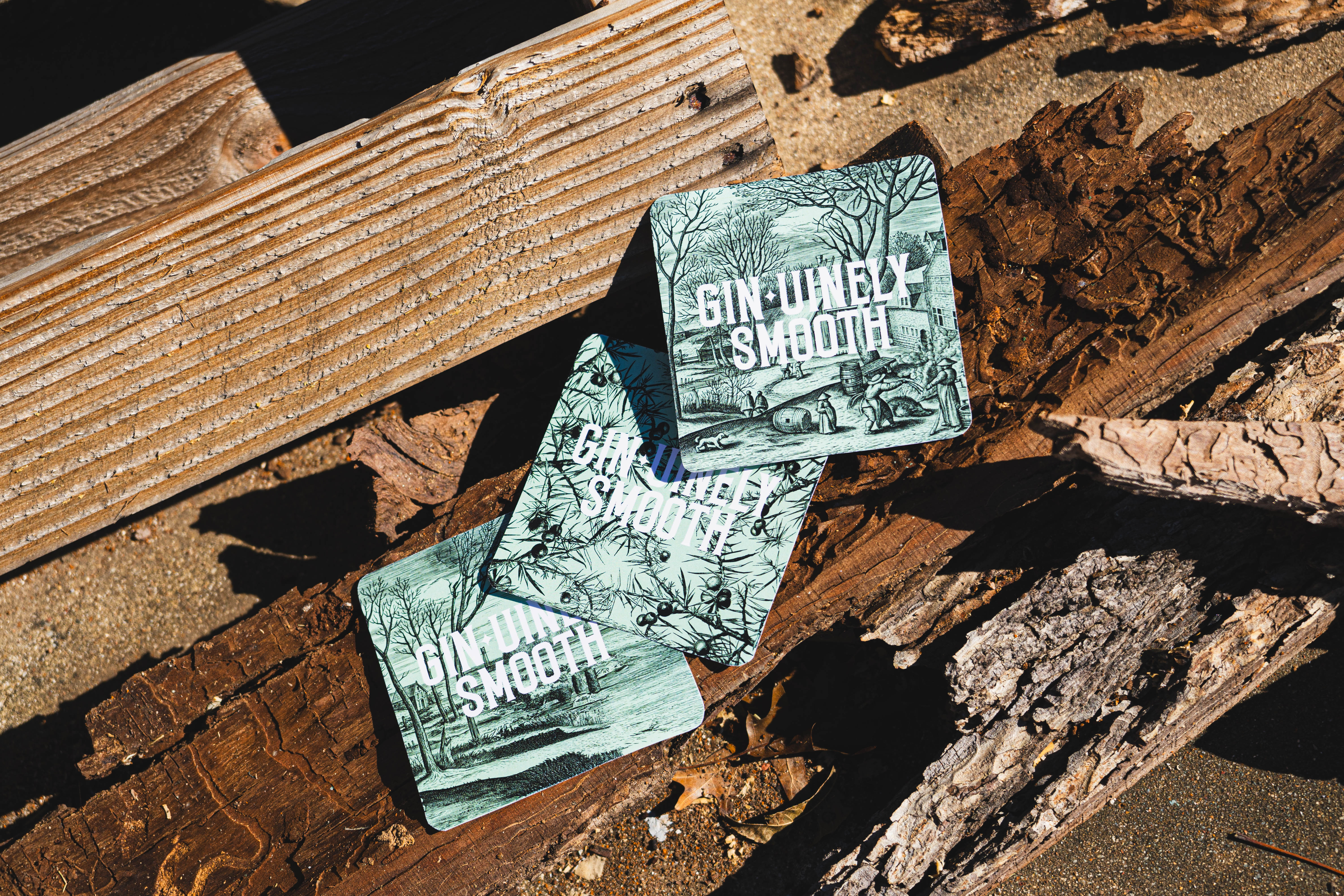
Coasters that carry the label’s “Gin-uinely smooth” line.
Coasters that carry the label’s “Gin-uinely smooth” line.

BEHIND THE SCENES
BEHIND THE SCENES


